
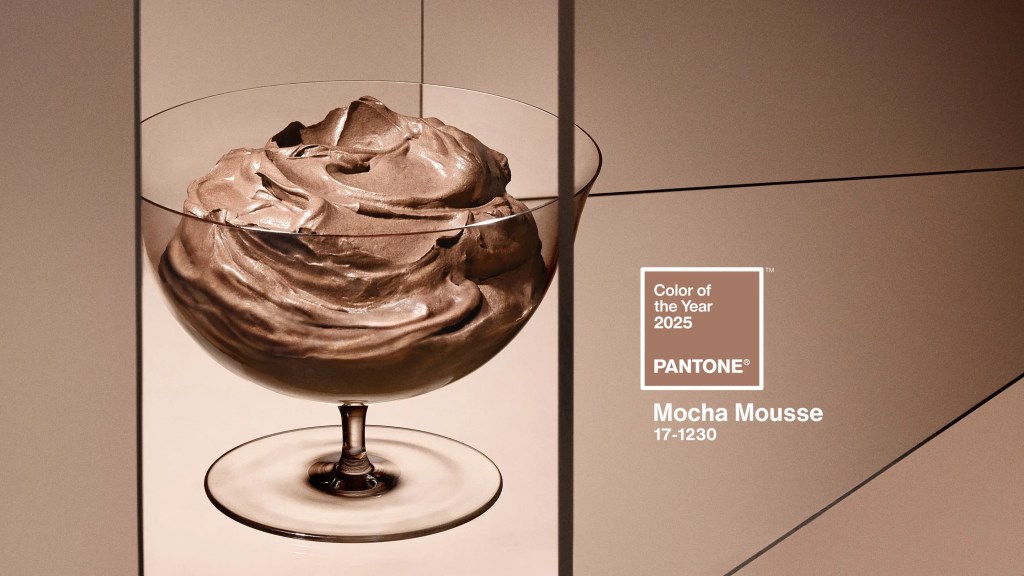
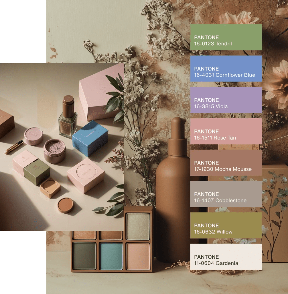
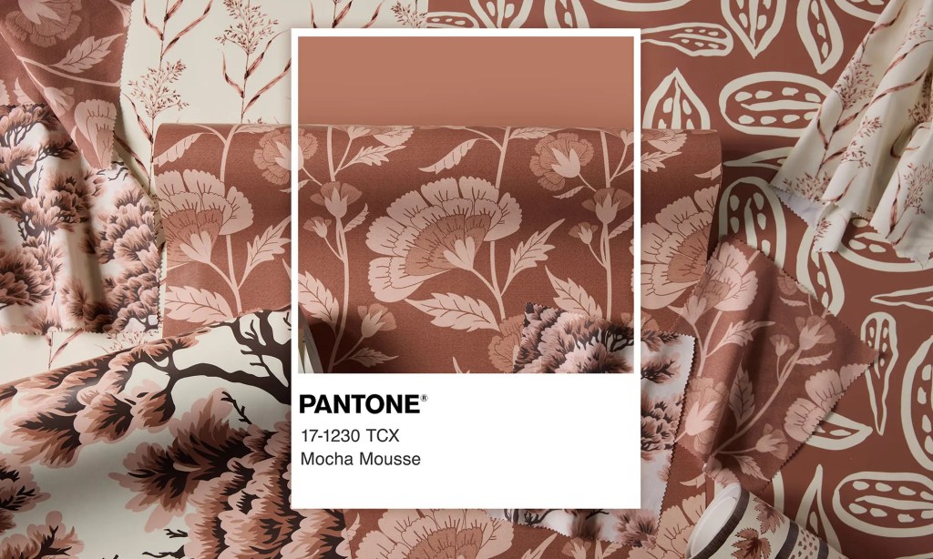
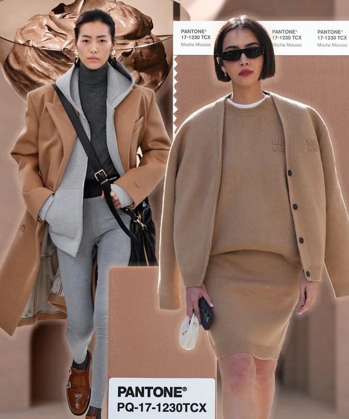
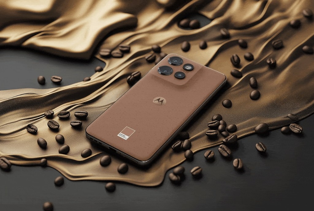
Pantone has announced their color of the year for 2025, Mocha Mousse. And while brown is far from my favorite color, I don’t hate it. I do like that this is more of a cool medium brown, which pairs well with many other colors I love. Many years ago, Beloved and I moved into a massive apartment in a pre-war building in Brooklyn on iconic Ocean Parkway. With the exception of our kitchen which was Tiffany blue and crisp white, the rest of the colors in the apartment were based upon Breyers Neapolitan ice cream. Breyers Neapolitan was a happy feature of my childhood, and I’ve never lost my fondness for anything that reminds me of the stuff (which I still prefer to almost all other ice cream flavors). The brown I used was a cool medium taupe brown just like Pantone’s Mocha Mousse, and it worked remarkably well with our burgundy leather furniture. I would use those colors again.
Anyway, back to Pantone. Mocha Mousse is a shade that the Pantone Color Institute describes as “an evocative soft brown that transports our senses into the pleasure and deliciousness it inspires while appealing to our desire for comfort.” Well, I’m certainly in the market for comfort, and the shade does play well with others. And as Huffpo pointed out, at least it’s not Brat Green.
You can learn more about the Pantone Color of the Year on their website.


December 10, 2024 at 7:31 am
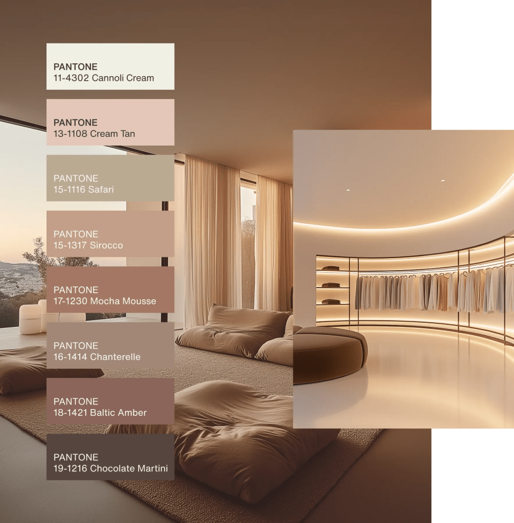
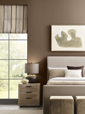
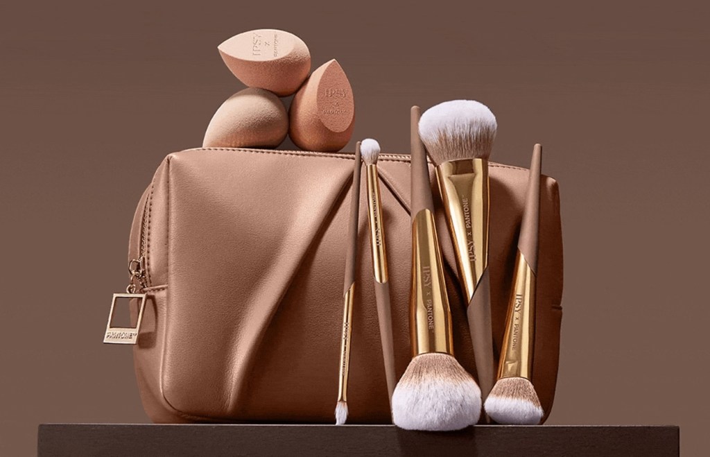
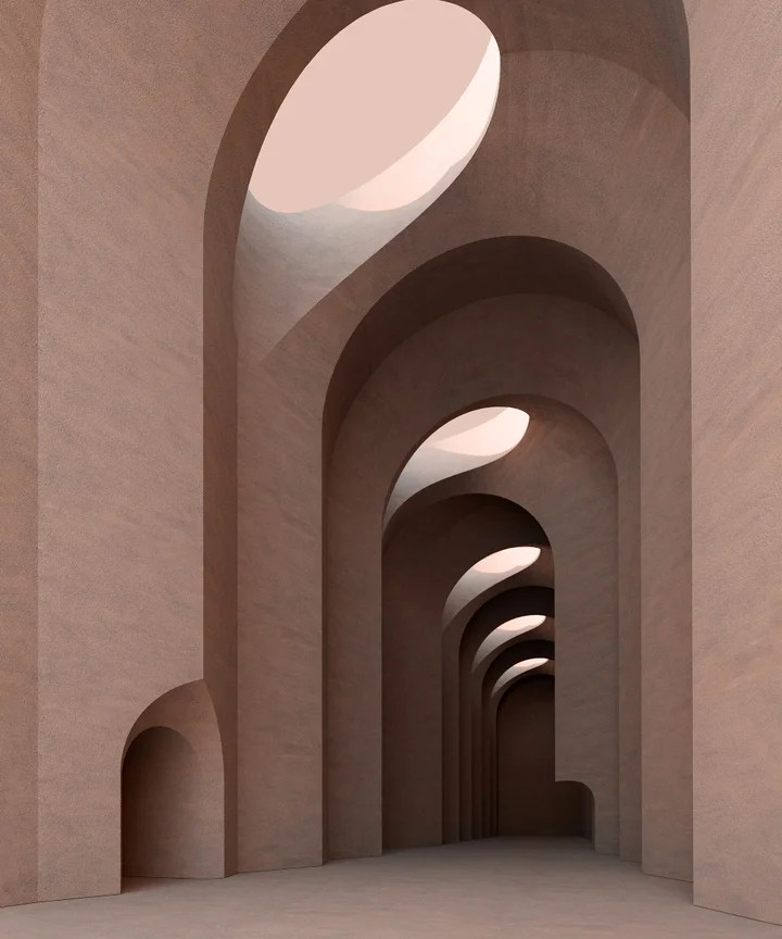
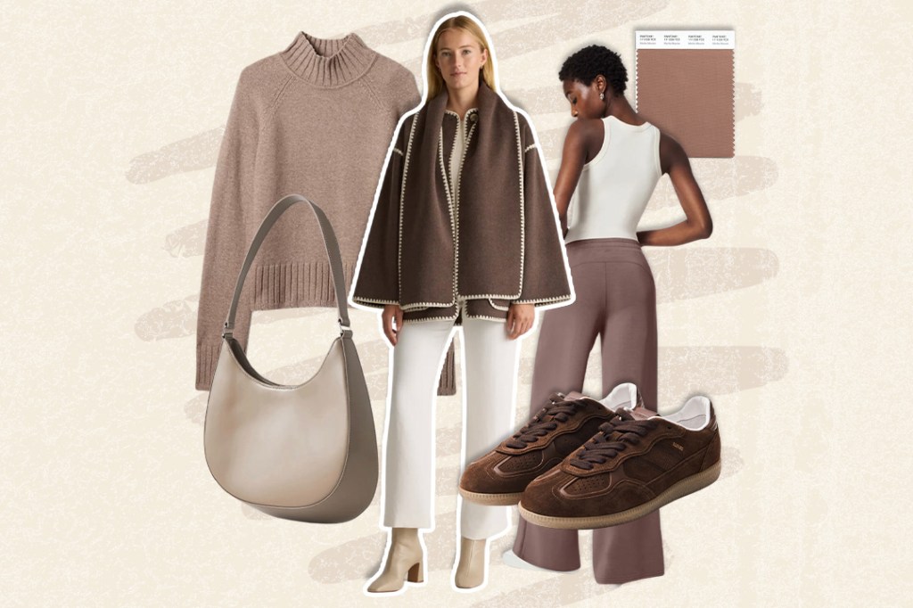
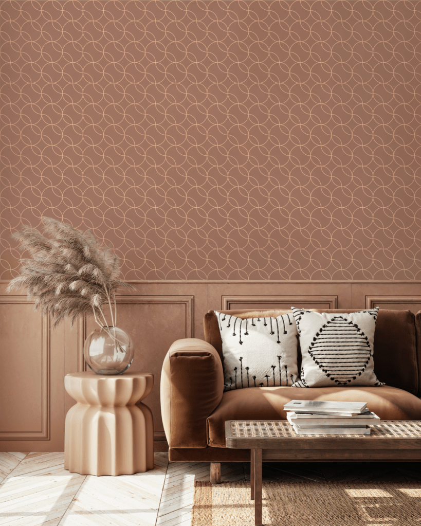
When I first saw the announcement, I thought the colour was pretty awful. In isolation, as just the sample card, it looked flat and drab to me. However, seeing it with some context of how it looks in home furnishings or clothing, I am actually convinced that it is a really pleasing neutral.
LikeLiked by 2 people
December 10, 2024 at 8:14 pm
I definitely don’t hate it. Of course, for me the cooler the shade the better, but it was really easy to live with.
LikeLiked by 1 person
December 10, 2024 at 9:31 am
I agree with Laura. Kind of bland by itself, but in the photos you have posted, it is really a pretty and pretty versatile neutral.
Now I would really like a dish of mocha mousse, though…
LikeLiked by 1 person
December 10, 2024 at 8:14 pm
Right? It did make me hungry.
LikeLiked by 1 person
December 10, 2024 at 11:04 am
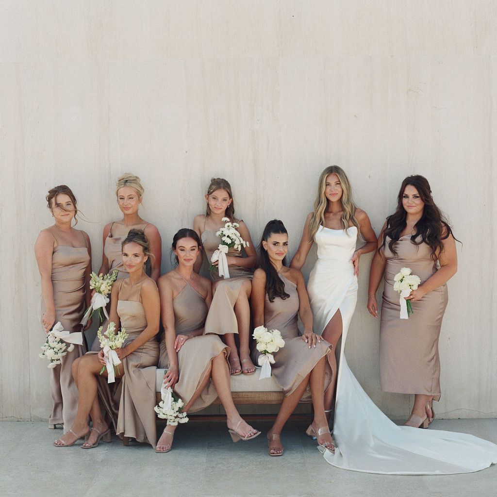
Sometimes a calm neutral is called for. This color has some lovely purple undertones, though, such that it almost falls into the Taupe world–not exactly brown, not exactly gray, and for that I like the versatility. It could be a polka dot on a lavender field or a cozy sweater for a gray day.
LikeLiked by 1 person
December 10, 2024 at 8:15 pm
Oh, I love the idea of this paired with lavender. What a cool idea!
LikeLike
January 28, 2026 at 10:58 am
Mocha Mousse definitely feels like a warm, comforting counterpoint to the louder color trends of recent years. It’s interesting that even Pantone nods to how bold shades dominate culture, especially when you think about how brat green became instantly recognizable through Charli XCX’s Brat era. That aggressive lime tone wasn’t about comfort at all, but confrontation and attitude, which makes Mocha Mousse feel like a cultural reset toward softness and balance after a very loud pop-culture moment.
LikeLiked by 1 person
January 29, 2026 at 1:20 pm
This year’s color, Cloud Dancer, was so uninspiring to me, I didn’t even write a post about it. While I wasn’t 100% in love with Mocha Mousse, at least it had something to say. I did like Etsy’s color of the year, Patina Blue.
LikeLike