
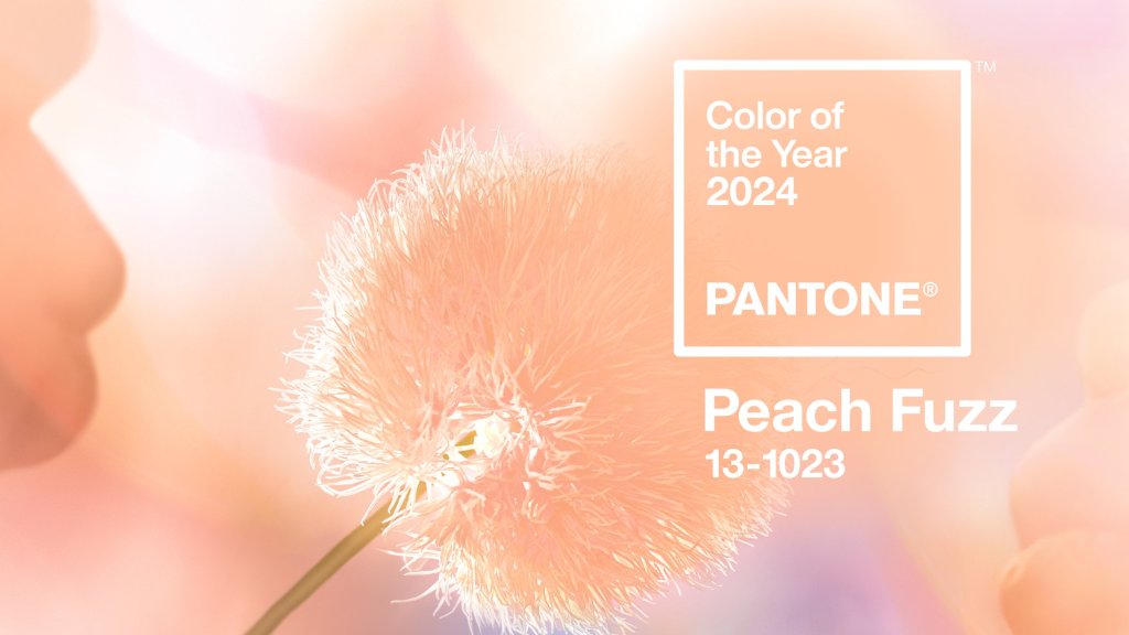
Amidst much anticipation, the folks at Pantone have declared the 2024 color of the year to be… Peach Fuzz. Ugh. Though 2023’s Pantone color of the year, Viva Magenta, wasn’t a shade I would have chosen, I found lots to love about it. However, I seriously doubt this year’s color is going to win me over. Peach? Really?
Pantone describes it as a “velvety gentle peach tone whose all-embracing spirit enriches mind, body, and soul,” but I describe it as “the color of my formica kitchen counters in 1987.” It also reminds me of that terrible crayon that came in the Crayola 64 pack in the early 1960s, which bore the unfortunate name of “flesh.” Who thought that was a good idea?
“In seeking a hue that echoes our innate yearning for closeness and connection, we chose a color radiant with warmth and modern elegance. A shade that resonates with compassion, offers a tactile embrace, and effortlessly bridges the youthful with the timeless.”
– Leatrice Eisenman, Executive Director, Pantone Color Institute
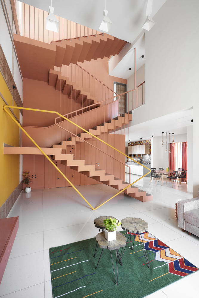
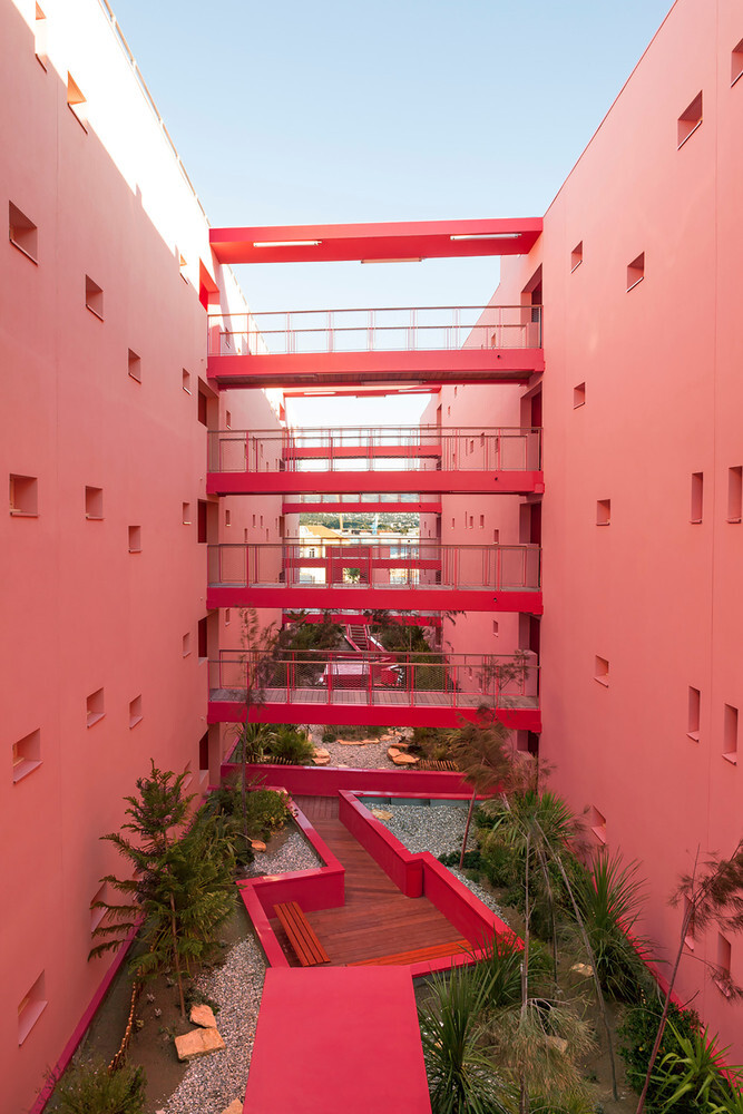
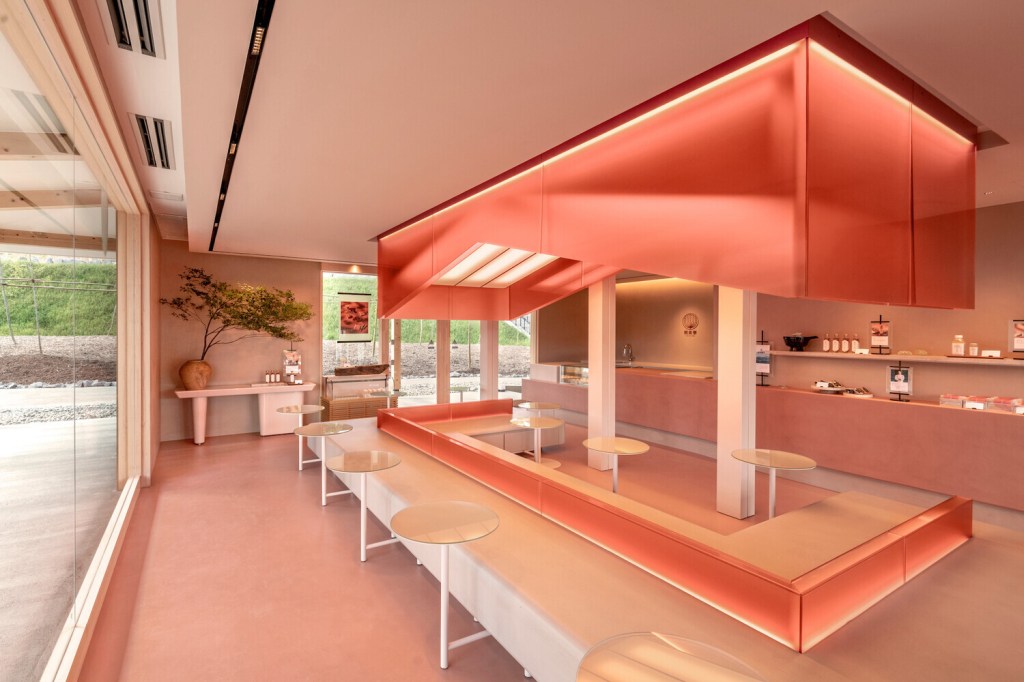
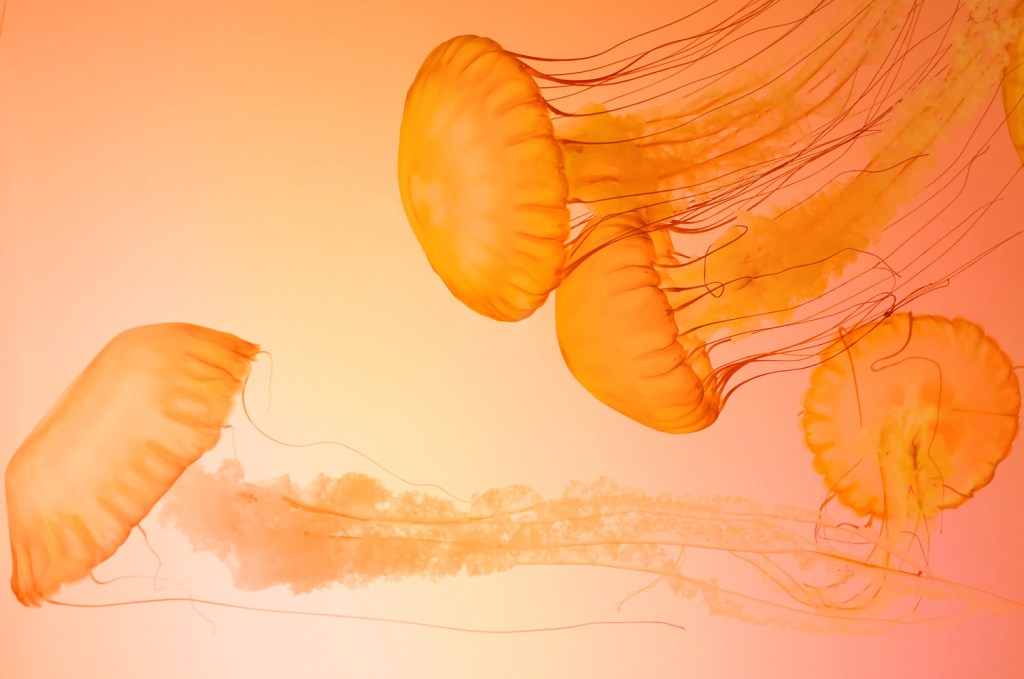
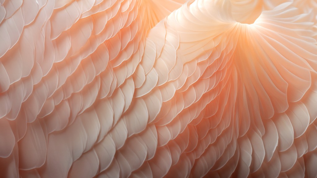
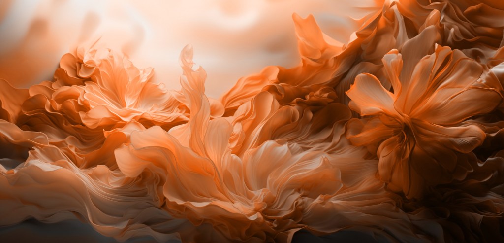
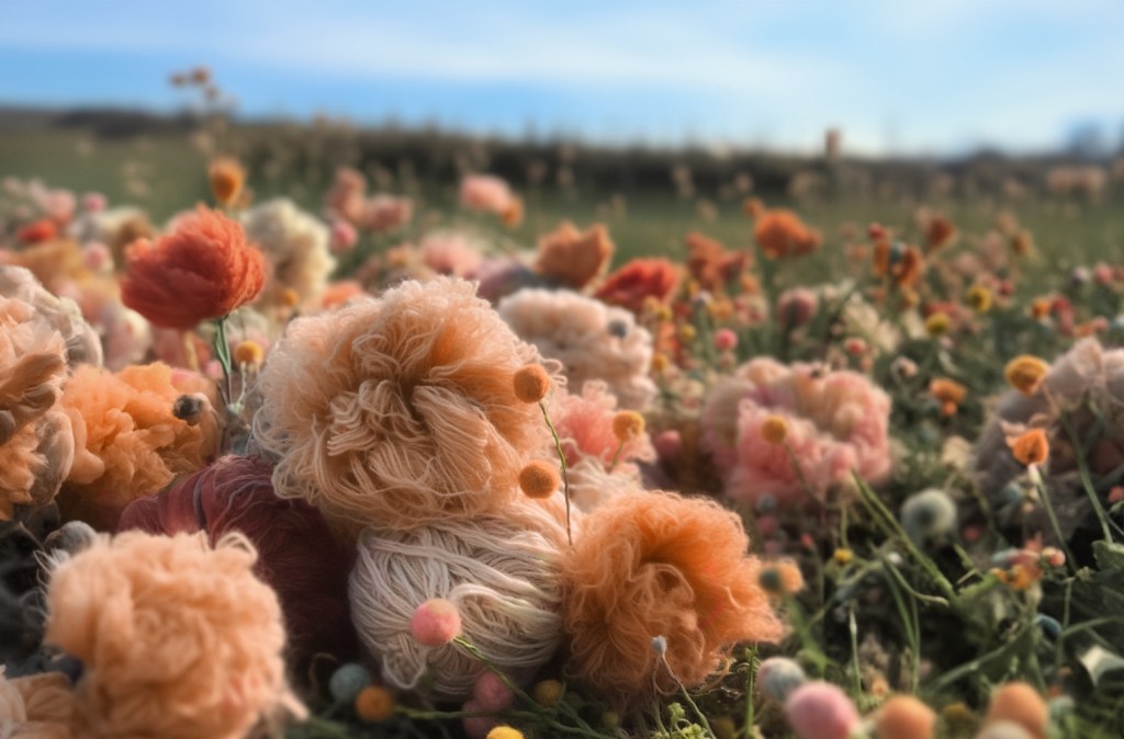
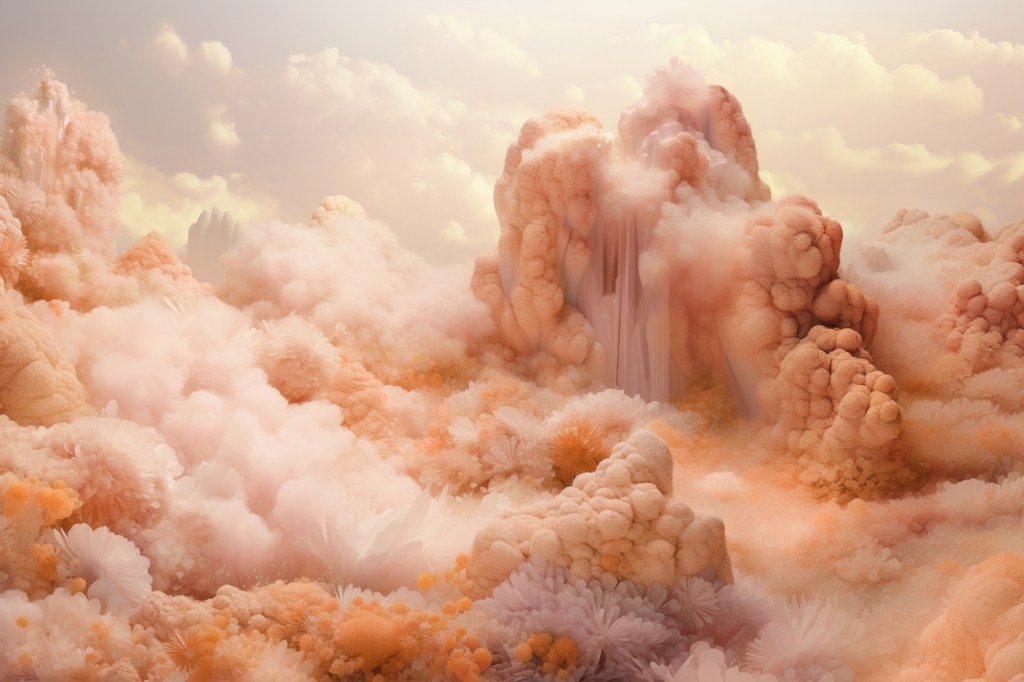
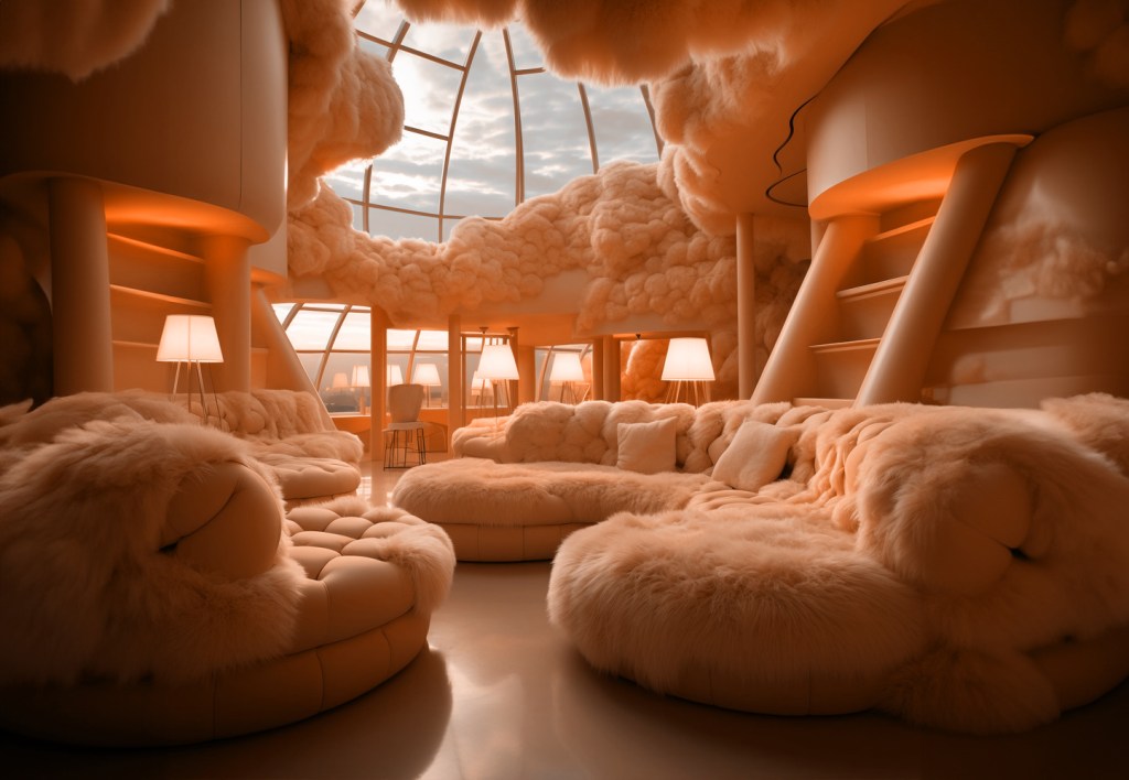
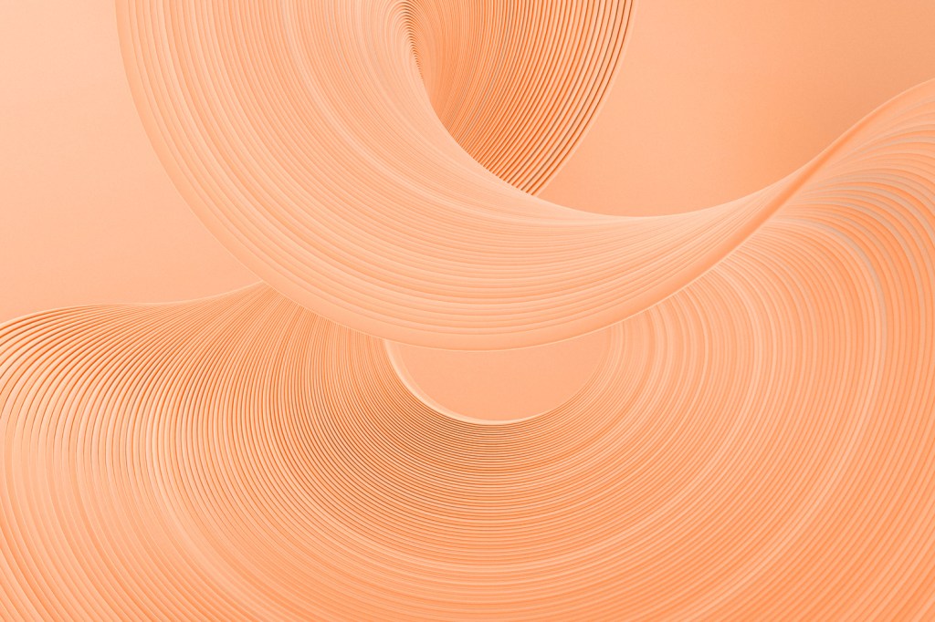
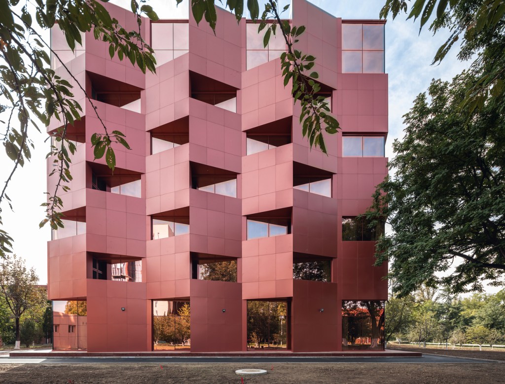
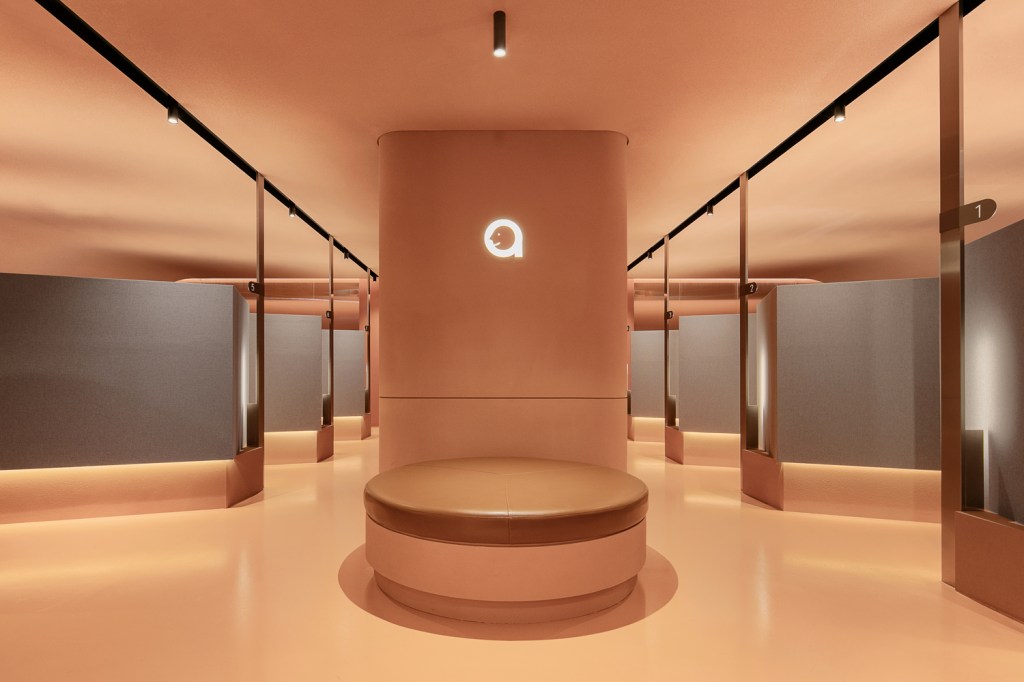
I would love to hear what you think of the shade. In the meantime, below are the images Pantone released to illustrate the year’s color. They’re pretty pictures, but I’d prefer them in almost any other color.


December 11, 2023 at 8:12 am
Ugh is just about right!
LikeLiked by 2 people
December 11, 2023 at 10:20 am
Thank you. Vindicated!
LikeLiked by 1 person
December 11, 2023 at 9:28 am
I remember that ‘Flesh’ crayon. Probably the only one in the box that didn’t need sharpening. Along with Raw Umber.
LikeLiked by 1 person
December 11, 2023 at 10:21 am
OMG 100%! So ugly, both of them.
LikeLiked by 1 person
December 11, 2023 at 2:31 pm
Yeah, this choice is a thumbs down miss for me too. It’s one of those neither here nor there colours, I think. Not quite pastel enough to be calming but not bold enough to be punchy. It’s a kind of sickly colour, I think, though that might be because it looks so vile against my skin. I really cannot see this colour making many inroads into trends in fashion or home decor. Maybe it works in really hot climates where everything else is bright white but even then I have my doubts.
LikeLiked by 1 person
December 12, 2023 at 5:00 pm
I look like death warmed over in this color. I suspect most people with lighter skin do. Two thumbs down!
LikeLiked by 1 person
December 11, 2023 at 6:30 pm
Um … I think the best use of this color is as an accent to either brighten up a more muted color or to soften a brighter orange. But I feel like I’m being transported back to an Arizona Taco Bell in the 90’s if there’s too much of that color. It really shouldn’t be used on it’s own as a standalone color.
LikeLiked by 1 person
December 12, 2023 at 5:00 pm
The Arizona Taco Bell in the 90s reference is perfect!
LikeLiked by 2 people