
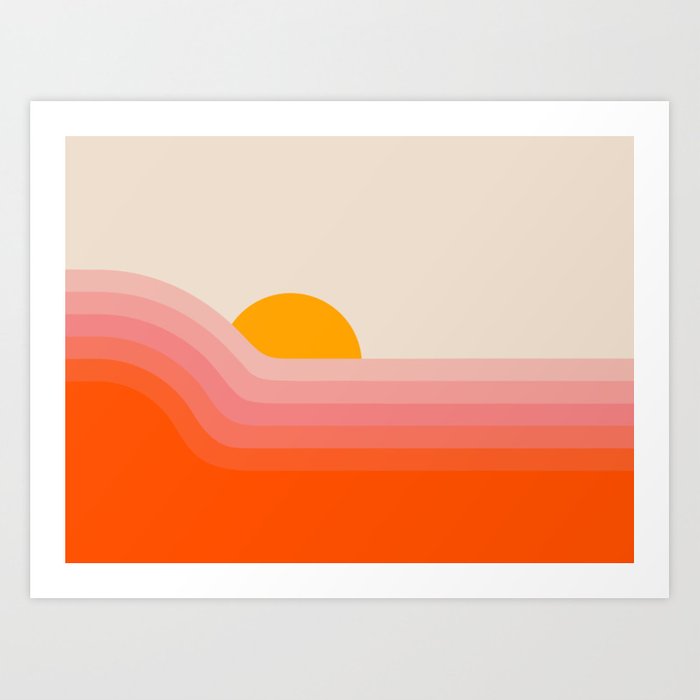
Graphic artist Rachel Bredeen (through her brand, Circa 78 Designs) has a terrific way with color and shape. All those delicious rainbows and gradients combined with her simple shapes remind me of the pop art of the seventies, but they feel so much more sophisticated and appealing.
“I’m a long-time maker of things and lover of bright colors + bold graphics. (I watched a lot of Sesame Street as a child and I think it left a strong impression on my little brain.) I love to create things that reflect my love of 70s interiors and designs. I think your living space should be full of things that bring you joy, and I hope you find something here that adds to your happy space.”
– Rachel Bredeen, Circa 78 Designs
There’s something remarkably calming about Bredeen’s art, though it’s far from boring. In addition to making for striking wall art, they’d also be spectacular on items like bedding or upholstery fabric, and I’d love to see them available as large-scale wall decals.
You can follow Rachel Bredeen on Instagram and Facebook, and you can buy Circa 78 Designs prints on Society 6 and Etsy.


July 10, 2020 at 7:30 am
Colorful? Yes…I like these.
LikeLiked by 1 person
July 10, 2020 at 3:44 pm
Me, too. They just make me happy!
LikeLike
July 10, 2020 at 7:47 am
these are great! thxs for noticing
LikeLiked by 2 people
July 10, 2020 at 3:44 pm
I am glad you like them!
LikeLike
July 10, 2020 at 11:39 am
You are spot on about the 1970s vibe. These transported me back to my childhood. But I also agree that they are more sophisticated than they would have been in the 1970s and I think that might be down to the colour palettes being more harmonious and not as clashing.
LikeLiked by 1 person
July 10, 2020 at 3:45 pm
I thought so, too. The colors are a little cooler and more sophisticated.
LikeLiked by 1 person
July 10, 2020 at 12:43 pm
I just did not understand what the artist was trying to accomplish. They are very nice and colorful. Using my normal standard, I would not want one hanging in my home but I think others might. Thinking back to the 70’s I don’t remember anything like this but maybe it was there and I just didn’t notice. I was 30’s and very active in sports. Probably my best sports years. Hal
LikeLiked by 1 person
July 10, 2020 at 3:46 pm
Every illustrated album cover and poster and magazine ad looked like this to me.
LikeLiked by 1 person
July 10, 2020 at 2:21 pm
I am wondering if the difference between these pieces and the art I remember from the ‘70’s has anything to do with the crispness of the colours. Graphic prints in the seventies were limited by the quality of print making back then. These prints have more vivid colours without pixilation.
LikeLiked by 1 person
July 10, 2020 at 3:47 pm
That’s a good point!
LikeLike
July 11, 2020 at 7:24 pm
This work does have a Peter Max vibe, not as busy of course.
LikeLiked by 1 person
July 11, 2020 at 9:13 pm
Fair point!
LikeLike