Etsom·ni·a (/etˈsämnēə/), noun, 1. a sleep disorder caused by obsessive Etsy browsing. 2. The surprising arrival of weird handmade merchandise ordered when one is only half conscious. (True story.) 3. An excuse for me to be an obnoxious, snarky New Yorker once per week.
For more Etsy fun, check out all my weekly Etsomnia™ posts!
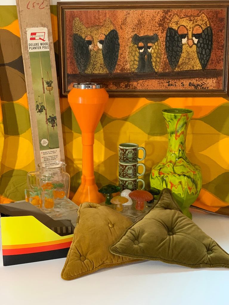
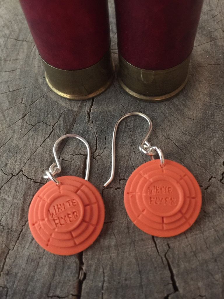
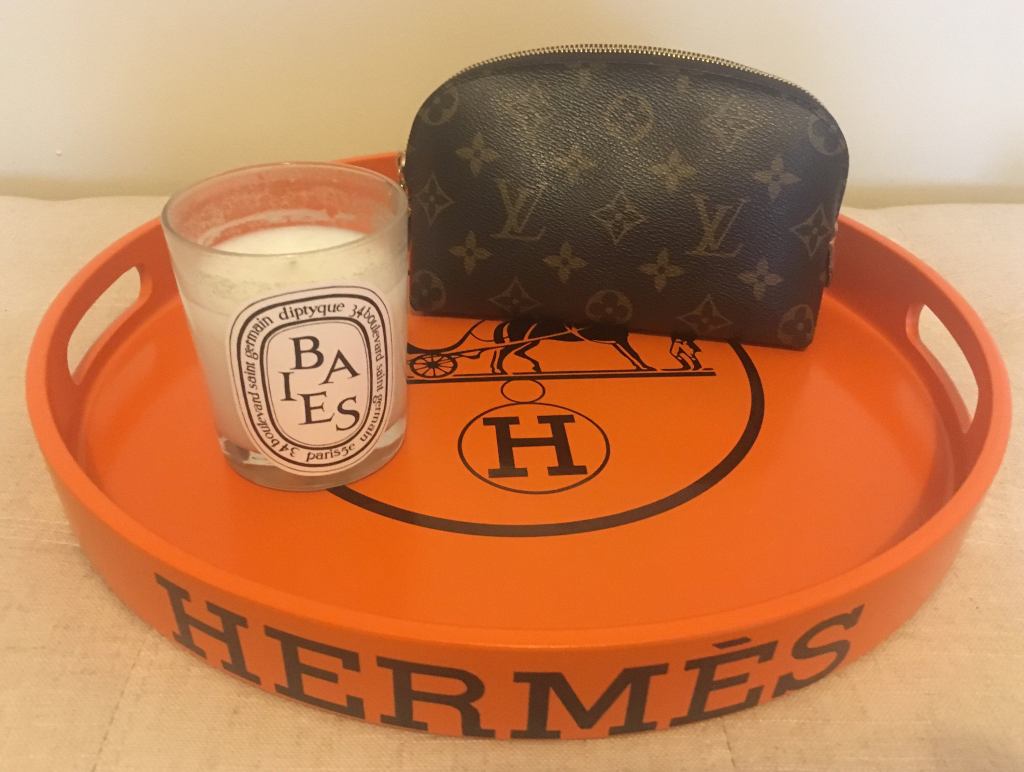
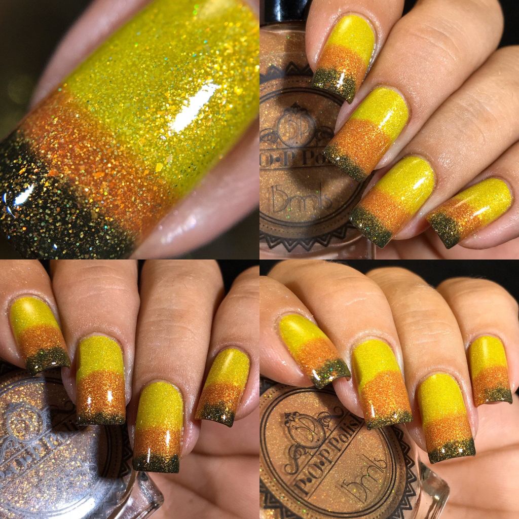
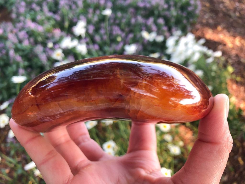
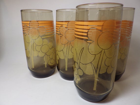
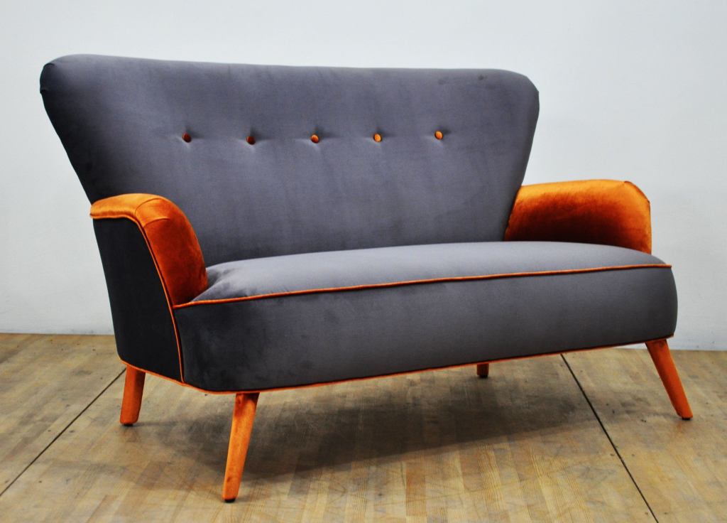
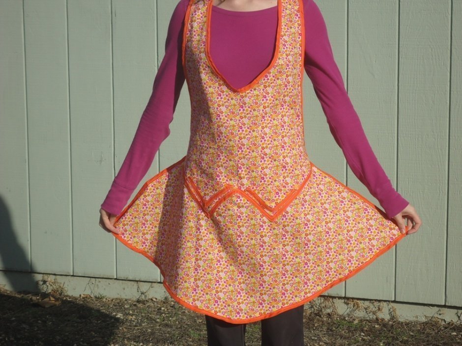
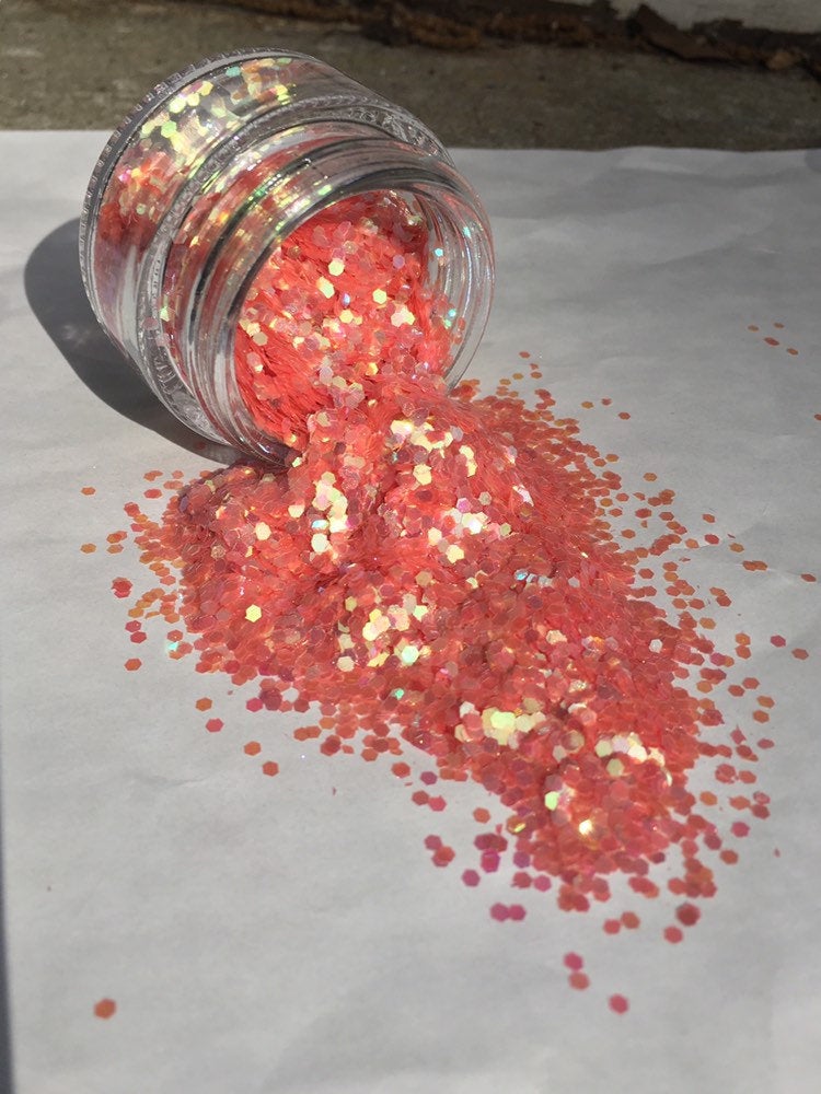
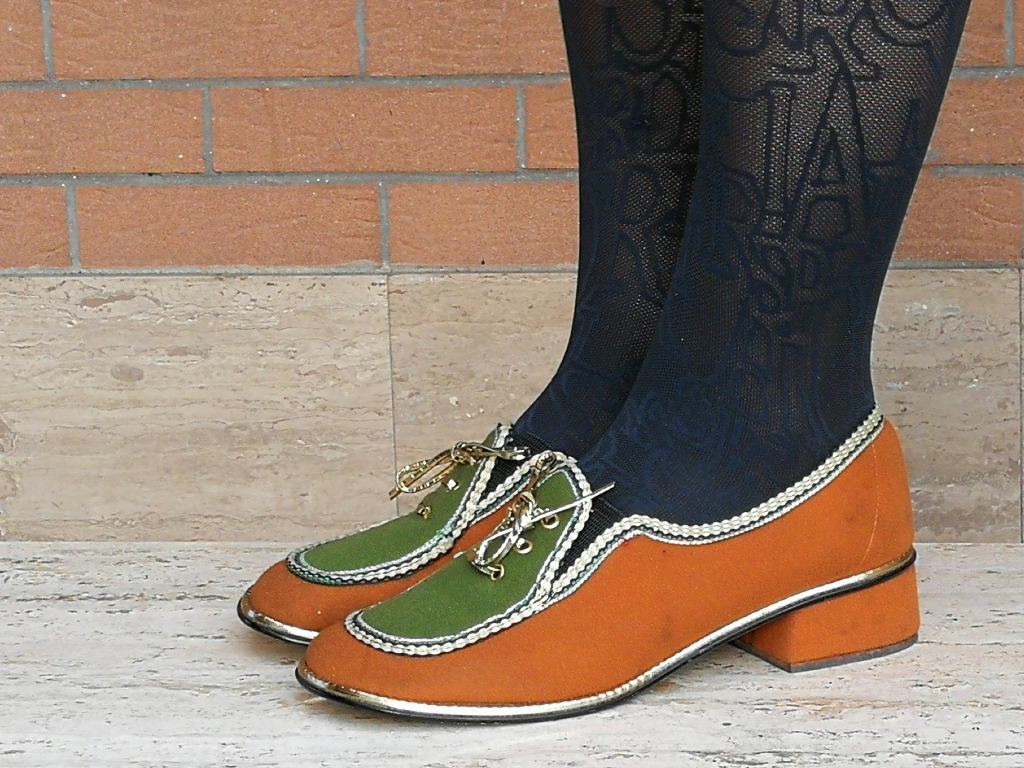
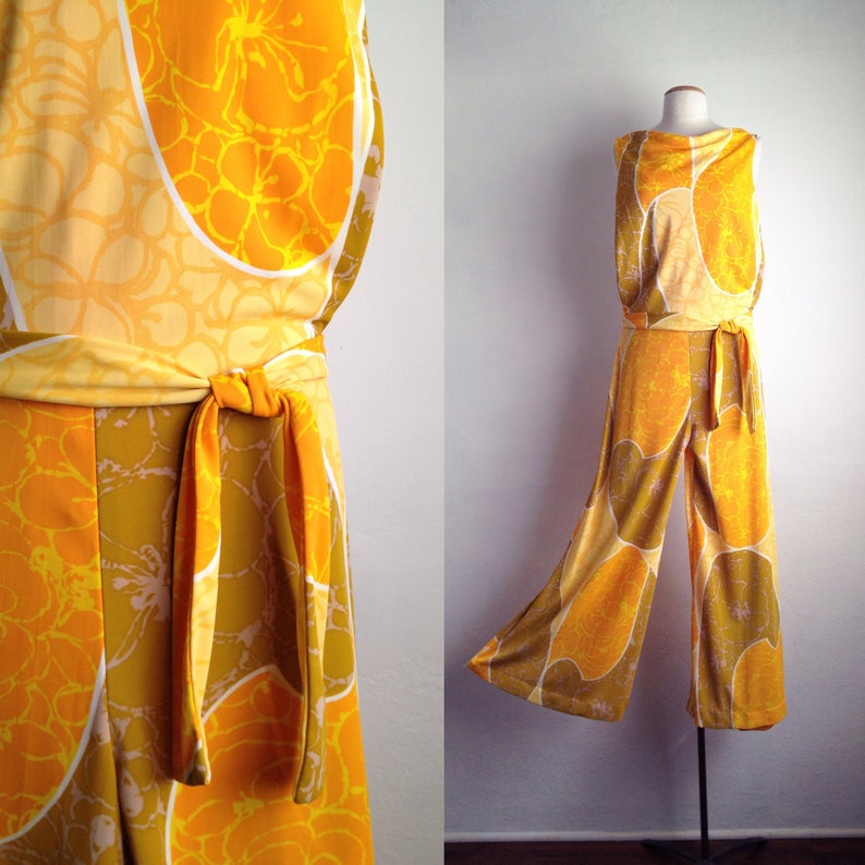
Kind of a fantastic assemblage, if that’s your thing. Ashtray byModSquadPickingSkeet earrings? Fine, but don’t come crying to me when some dummy shoots your head off…Obviously, when I’m complaining about orange, I don’t mean Hermès orange. By DemalonerHideous. On the bright side, I’d probably lose weight because I wouldn’t want those things anywhere near my mouth…I can admire the beauty of carnelian, even if it’s not my favorite color. By MoonLotusCrystalsI’d hide, too.I like the look of this hanging ashtray, but I know that back when I was a smoker, I would have knocked into it, spilling the contents, constantly. Cool, though! By MSGEngineeringI remember these at a friend’s house when I was a kid. “Donna, would you like something to drink?” “No, thanks, Mrs. C.. I’ll just drink from the bottle.”I admit it. This is gorgeous. By NameDesignStudioTo be fair, I’m not sure I’d like this in any color.I’m a sucker for plastic-free glitter, even when it’s orange! By GlitterNymphI sometimes wonder whether things like this were made to prank the color blind or to torture the rest of us.This is so well done, I think even I could live with this stylish touch of orange in my house! By RedMoonStudioArtThis is actually making me a bit queasy. The pattern looks like vomit under a microscope.
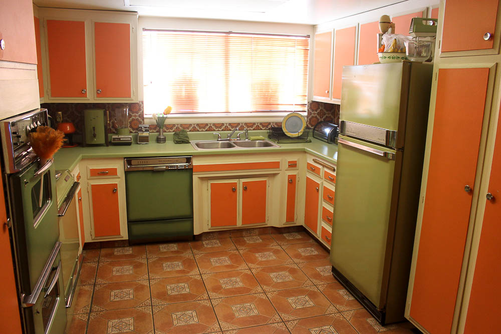
I rate orange as an accessory colour. It goes with the basics black, navy, grey and brown but that’s about it. Definitely not in kitchens and your photo puts me in mind of a 70s example in a friends’ place in Switzerland. It’s in mint condition still, but it’s still orange!
Harvest orange and avocado green are hideous, and yet I had a friend who wanted all orange countertops in his home when we were kids. He’s grown out of that, thank God. Only as an accent, and sparingly!
I remember one friend who had not only those counters and appliances, but that horrid flowery wallpaper (you probably know the one) that featured both avocado green and harvest orange. I didn’t visit there often. 🤢
Usually I do like orange and use it mostly as accessories, as it fit fine into my other clothe.
I do remember the kitchens in colors like at your photo from the 1970. Old fashion and not my style either.
The carnelian is always beautiful 😀
I am another who does not like orange (unless it is fruit related) and I have often wondered if it was because of all tbe brown and orange decor surrounding me in my 1970s childhood. Several of my preschool students have proclaimed that orange is their favourite colour probably precisely because they did not endure that interior design trauma.
As an aside, thank you for bringing non-plastic glitter to my attention. I will need to investigate that. I don’t use glitter in my classroom but might reintroduce it if there is a more ethical option.
I really do think it’s the 1960s and 1970s that ruined it for us. And biodegradable glitter is all I use now. Of course, I don’t know what I’m going to do with all the old plastic junk…
OH MY GAWD! I thought I was the only one with 70’s decor trauma. We had a vivid orange/green/brown striped couch that was a velvet material. We almost never sat on it, which is why the fabric didn’t wear out before I moved on to adulthood. (I may have joined the Army just to get away from the color spectrum.)
As for the hanging ash tray, is there any chance it is a re-purposed bird feeder? Just a guess.
If you added a bit more orange, that was basically our couch. It actually was pretty cool. But the entire house was done in a lot of the avocado green, nauseated yellow, and anemic orange, so it was a bit overwhelming. We had a giant console stereo–the kind with the speakers built into each end. I’m trying to see if I can post a link or a photo here: https://www.pinterest.com/pin/102808803969588370/
Not sure if the right one will come up, but you’ll know it when you see it. Somethings cannot be unseen.
I agree with you on all of these except the Hermes and the glitter, neither of which I like because they’re orange. I think the only orange thing I can think of that I like is road cones.
There is a church on Vancouver Island in British Columbia where in a redecorating scheme the attempt was to get a kind of Tuscan feel. The walls were painted a kind of off-orange and the timbers of the roof were painted black. Unfortunately, the result in rainy, cool BC was less warm Tuscan than Tim Burton, and reminded me of Halloween.


October 31, 2019 at 6:54 am
I rate orange as an accessory colour. It goes with the basics black, navy, grey and brown but that’s about it. Definitely not in kitchens and your photo puts me in mind of a 70s example in a friends’ place in Switzerland. It’s in mint condition still, but it’s still orange!
LikeLiked by 1 person
October 31, 2019 at 1:47 pm
That’s disappointing. I always thought the Swiss would have better taste.
LikeLiked by 1 person
October 31, 2019 at 3:19 pm
Well, you’re bound to get one or two who don’t……….
LikeLiked by 1 person
October 31, 2019 at 4:46 pm
Hahah. Fair point.
LikeLiked by 1 person
October 31, 2019 at 7:09 am
Harvest orange and avocado green are hideous, and yet I had a friend who wanted all orange countertops in his home when we were kids. He’s grown out of that, thank God. Only as an accent, and sparingly!
LikeLiked by 2 people
October 31, 2019 at 1:47 pm
Yike! I honestly don’t know how anyone could enjoy a meal surrounded by that color scheme!
LikeLike
October 31, 2019 at 1:49 pm
On the bright side, it’s a workable diet plan. 😏
LikeLiked by 1 person
October 31, 2019 at 1:51 pm
Of course! No wonder I was such a skinny kid!
LikeLike
October 31, 2019 at 1:55 pm
I remember one friend who had not only those counters and appliances, but that horrid flowery wallpaper (you probably know the one) that featured both avocado green and harvest orange. I didn’t visit there often. 🤢
LikeLiked by 1 person
October 31, 2019 at 4:46 pm
Yep. That was our kitchen. The counters and cabinets were pretty neutral, but there was no getting around those awful prints. What were they thinking?
LikeLike
October 31, 2019 at 4:48 pm
“How can we scar our children for life?” 😉
LikeLiked by 1 person
October 31, 2019 at 8:28 am
Orange? only the fruit please.
LikeLiked by 1 person
October 31, 2019 at 1:47 pm
I wish I had said that!
LikeLiked by 1 person
October 31, 2019 at 8:33 am
I’m with you on the color orange. Don’t like it at all!
LikeLiked by 1 person
October 31, 2019 at 1:49 pm
I always feel a little guilty about my reaction to that particular color family, but I just can’t help it!
LikeLiked by 1 person
October 31, 2019 at 8:53 am
YUCK
LikeLike
October 31, 2019 at 10:33 am
Usually I do like orange and use it mostly as accessories, as it fit fine into my other clothe.
I do remember the kitchens in colors like at your photo from the 1970. Old fashion and not my style either.
The carnelian is always beautiful 😀
LikeLiked by 1 person
October 31, 2019 at 1:50 pm
The carnelian really is gorgeous stuff. And orange in an accessory makes sense, too.
LikeLiked by 1 person
October 31, 2019 at 12:44 pm
I am another who does not like orange (unless it is fruit related) and I have often wondered if it was because of all tbe brown and orange decor surrounding me in my 1970s childhood. Several of my preschool students have proclaimed that orange is their favourite colour probably precisely because they did not endure that interior design trauma.
As an aside, thank you for bringing non-plastic glitter to my attention. I will need to investigate that. I don’t use glitter in my classroom but might reintroduce it if there is a more ethical option.
LikeLiked by 1 person
October 31, 2019 at 1:51 pm
I really do think it’s the 1960s and 1970s that ruined it for us. And biodegradable glitter is all I use now. Of course, I don’t know what I’m going to do with all the old plastic junk…
LikeLiked by 2 people
October 31, 2019 at 4:08 pm
I just haven’t been using glitter and, must admit, I cannot say I have especially missed using it in the classroom.
LikeLiked by 1 person
October 31, 2019 at 4:52 pm
The biodegradable stuff is a little more expensive than the regular cosmetic-use glitter, but I find it every bit as good, and I feel better about it.
LikeLiked by 1 person
October 31, 2019 at 1:09 pm
LikeLike
October 31, 2019 at 3:30 pm
OH MY GAWD! I thought I was the only one with 70’s decor trauma. We had a vivid orange/green/brown striped couch that was a velvet material. We almost never sat on it, which is why the fabric didn’t wear out before I moved on to adulthood. (I may have joined the Army just to get away from the color spectrum.)
As for the hanging ash tray, is there any chance it is a re-purposed bird feeder? Just a guess.
LikeLiked by 1 person
October 31, 2019 at 4:52 pm
SO DID WE!!! Ours was basically this one, only worse colors: https://i.etsystatic.com/6437264/r/il/b60e7c/2043804922/il_794xN.2043804922_1ic0.jpg
We didn’t sit on ours either. The console stereo was in the living room, and I was totally into music as a kid, but if I wanted to listen, I had to sit on the floor.
LikeLiked by 1 person
December 2, 2019 at 7:15 pm
If you added a bit more orange, that was basically our couch. It actually was pretty cool. But the entire house was done in a lot of the avocado green, nauseated yellow, and anemic orange, so it was a bit overwhelming. We had a giant console stereo–the kind with the speakers built into each end. I’m trying to see if I can post a link or a photo here: https://www.pinterest.com/pin/102808803969588370/
Not sure if the right one will come up, but you’ll know it when you see it. Somethings cannot be unseen.
LikeLiked by 1 person
December 2, 2019 at 8:36 pm
We also had a console stereo. Ours had a turntable, am/fm radio, and 8-track player. At least yours was stylish. Ours looked like this behemoth:
https://www.letgo.com/en-us/i/1970s-morse-electrophonic-console-stereo_3995f506-f7a5-4d78-864a-90f19328f6a4
The mind boggles.
LikeLiked by 1 person
November 1, 2019 at 10:00 am
I agree with you on all of these except the Hermes and the glitter, neither of which I like because they’re orange. I think the only orange thing I can think of that I like is road cones.
LikeLiked by 1 person
November 1, 2019 at 2:23 pm
And the fruit!
LikeLike
November 2, 2019 at 4:44 am
There is a church on Vancouver Island in British Columbia where in a redecorating scheme the attempt was to get a kind of Tuscan feel. The walls were painted a kind of off-orange and the timbers of the roof were painted black. Unfortunately, the result in rainy, cool BC was less warm Tuscan than Tim Burton, and reminded me of Halloween.
LikeLiked by 1 person
November 2, 2019 at 12:06 pm
Ha! I can see that. Poor things. They must have been so disappointed.
LikeLike