
Pantone mug above by HitTheBalance.
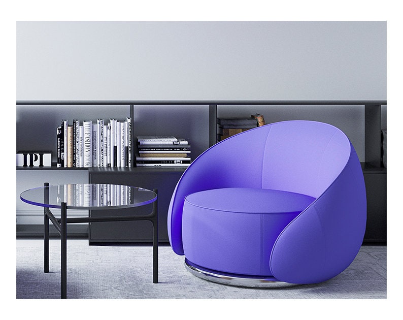
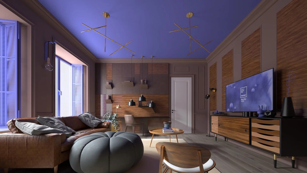
If you asked me about my favorite colors, I would talk about turquoises and teals and purples and greys. But if you really pressed me to choose One Color Above All Others… it would have to be periwinkle. A happy medium between blue and purple, periwinkle reminds me of hydrangeas and morning glories and summer days. This year, the Pantone Color Institute has named Very Peri (PANTONE 17-3938) the color of the year for 2022. I love how optimistic and hopeful it makes me feel.

This is the first time in the history of the Pantone Color of the Year that the Institute created a new color specifically for the purpose. I just love it! Below are some creative ways to incorporate my favorite color in your home design.
You can learn more about the Pantone Color of the Year on their website.


December 30, 2021 at 8:16 am
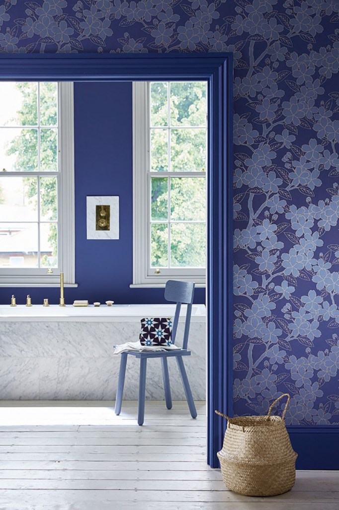
My sister chose periwinkle for the walls in her great room, which is visible from everywhere in her home. I was unsure about painting it, but it was her choice, so I cut in and rolled and waited . . . She was a year ahead of Pantone! The color is perfectly neutral, accepting and improving cool and warm colors into its company with the ease of a beige or gray, but with the style and energy they can only envy. Thanks for continuing your posts for beauty. Happy New Year!
LikeLiked by 2 people
December 30, 2021 at 9:34 am
Happy new year, my dear! Your sister is a visionary!
LikeLike
December 30, 2021 at 8:41 am
I remember hearing a woman in a clothing store telling another woman that periwinkle is the one color that looks good on everyone. Great choice, Pantone.
LikeLiked by 2 people
December 30, 2021 at 9:34 am
I think that’s probably true!
LikeLiked by 1 person
December 30, 2021 at 9:07 am
Don’t know why but my current favorite color in pale blue/powder blue. But all the pictures today look great. So, I have a new color to think about. Hal
LikeLiked by 1 person
December 30, 2021 at 9:35 am
I do love pale blue, too…
LikeLike
December 30, 2021 at 10:46 am
Yes! I adore this colour. I painted the main bedroom of the first home we owned in a very similar colour and the family bathroom in our last home in Scotland was also painted this colour but with added glitter.
LikeLiked by 1 person
December 30, 2021 at 2:51 pm
That sounds delish!
LikeLiked by 1 person
December 30, 2021 at 12:12 pm
I’m not one for blue normally but this is pretty and blue does make green which I love.
LikeLiked by 2 people
December 30, 2021 at 2:52 pm
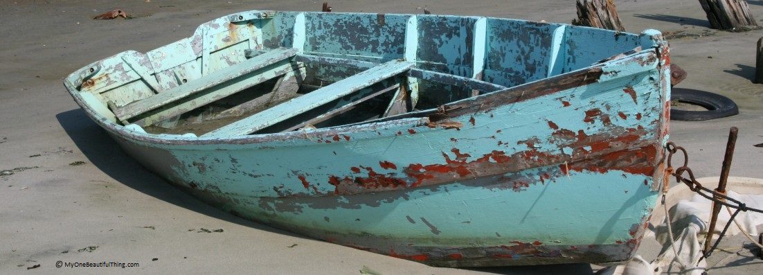
I especially loved it paired with the light turquoise.
LikeLiked by 1 person
January 14, 2022 at 10:10 am
Many thanks, Donna, for featuring our Tall Ampersand typography poster and our Little Miss line art print.
LikeLiked by 1 person
January 14, 2022 at 11:48 am
You do beautiful work!
LikeLike